
Okay, picture this: You’ve just updated to the latest iOS – iOS 26.1. Everything looks sleek, futuristic even, thanks to the liquid glass design. But there’s a catch. The text? A bit…off. Squinting isn’t exactly the vibe you’re going for with your cutting-edge device. That’s where this tutorial comes in. Forget endlessly tweaking settings. We’re diving deep to truly optimize readability. Consider this your personal guide to making iOS 26.1 a visual dream.
Understanding Liquid Glass and Readability Challenges
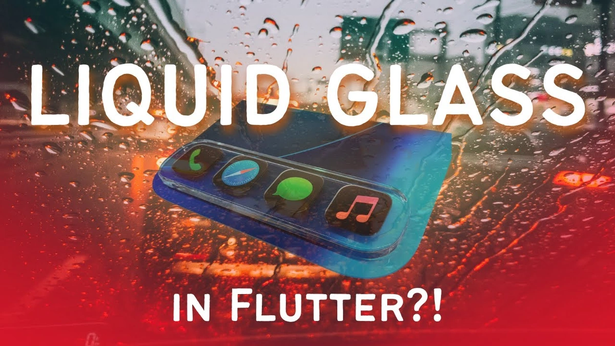
Liquid Glass , as a design concept, focuses on depth, translucency, and a certain vibrant pop. Think of it as the digital equivalent of those cool resin sculptures. It looks amazing! But here’s the thing: all that shininess and subtle layering can sometimes play havoc with text clarity. It’s not the font itself, it’s how the font interacts with the background. And Apple, in their infinite wisdom, doesn’t always get it perfect straight out of the gate. This is why understanding the underlying challenges is key. The goal isn’t just bigger text (though that helps!), it’s optimizing the entire visual experience. Let’s be honest, straining your eyes to read is so last decade.
Step-by-Step Guide to Crystal-Clear Text
Alright, let’s get our hands dirty. This is where the “How” angle really shines. We’re not just talking theory; we’re fixing this thing, together.
- Accessibility Settings – Your Secret Weapon: Did you know iOS has a whole section dedicated to making things easier to see? Head over to Settings > Accessibility > Display & Text Size. This is your control center.
- Bold Text: Seems simple, right? But toggling on ‘Bold Text’ can make a surprising difference. It adds weight to the font, helping it stand out against those glossy backgrounds.
- Increase Contrast: This is where things get interesting. Bumping up the contrast can dramatically improve text legibility. Experiment with this setting until you find a sweet spot. Too much, and things look harsh; too little, and you’re back to square one.
- Reduce Transparency: Here’s the kicker. Those translucent layers that make liquid glass so visually appealing? They’re also the culprits behind some readability issues. Reducing transparency can create a more solid backdrop for your text.
- Color Filters: This one’s a bit more advanced, but hear me out. iOS allows you to apply color filters to the entire display. If you find that certain colors are harder to read than others, try experimenting with these filters. It sounds weird, I know, but it works! I initially thought this was straightforward, but then I realized the color filters are more subtle than I initially percieved.
- Font Size Customization: Of course, we can’t forget the basics. Under Display & Text Size, you’ll find options to adjust the font size. Don’t be afraid to go big! Remember, it’s about comfort and clarity. As per the guidelines mentioned in the information bulletin , you can adjust this setting to suit your needs.
Advanced Tweaks for the Discerning Reader
Okay, so you’ve mastered the basics. What if you want to go even further down the rabbit hole? There are a few more tricks up my sleeve.
- Custom Font Profiles: While iOS doesn’t natively support custom fonts system-wide (yet!), you can use apps that allow you to import and use different fonts within their own interfaces. This can be a game-changer for reading apps.
- Dark Mode Optimization: Dark Mode isn’t just trendy; it can also improve readability in low-light conditions. The key is to find a color scheme that works well with the liquid glass aesthetic. Experiment with different accent colors and background shades.
- Reader View in Safari: Safari has a built-in Reader View that strips away all the clutter from web pages, leaving you with just the text. This is incredibly useful for reading articles online. A common mistake I see people make is not using this feature enough.
Troubleshooting Common Issues
Let’s be honest, things don’t always go according to plan. Here are a few common problems you might encounter, and how to solve them:
- Text Looks Blurry: Make sure your display zoom is set correctly. If it’s too low, text can appear pixelated.
- Colors Are Washed Out: Check your color filters. You might have accidentally enabled one without realizing it.
- Settings Keep Resetting: This is rare, but it can happen. Try restarting your device. If that doesn’t work, you might need to restore your iOS.
And, remember to always check the phone models for compatibility before making major changes.
The Future of Liquid Glass and Readability
What fascinates me is where this is all heading. As displays become more advanced and operating system designs get even more immersive, the challenge of balancing aesthetics and functionality will only intensify. We’re likely to see more AI-powered features that automatically adjust display settings based on ambient lighting and user preferences. Imagine a future where your phone knows exactly how to optimize readability for your eyes, in any situation. That’s the dream, right? For now, though, these manual tweaks will have to do. But hey, at least you’re armed with the knowledge to make your iOS 26.1 experience a truly enjoyable one. By the way, did you know that liquid crystal technology is a key component in modern displays?
FAQ
What if the bold text is too much?
Some people find the bold text setting a bit too strong. Try adjusting the text size and contrast first. If bold text is still too much, unfortunately, you’ll have to leave it off.
Can I adjust readability settings for specific apps only?
Sadly, iOS doesn’t offer app-specific readability settings. Changes you make in Accessibility affect the entire system.
Will these tips work on older iPhones?
Many of these tips will work on older iPhones, but the exact location of the settings might be slightly different.
I’ve tried everything, and the text is still hard to read!
It’s possible that there’s an underlying issue with your display. Consider taking your device to an Apple Store for evaluation. You may also need to assess if you need glasses.
Ultimately, enhancing liquid glass readability on iOS 26.1 is a journey, not a destination. It’s about finding the perfect balance that works for your eyes and your preferences. So, go forth and experiment! And remember, reading should be a pleasure, not a chore.